UEA narrows logo redesign options, staff to return with refined concepts
Get AI-powered insights, summaries, and transcripts
Subscribe
Summary
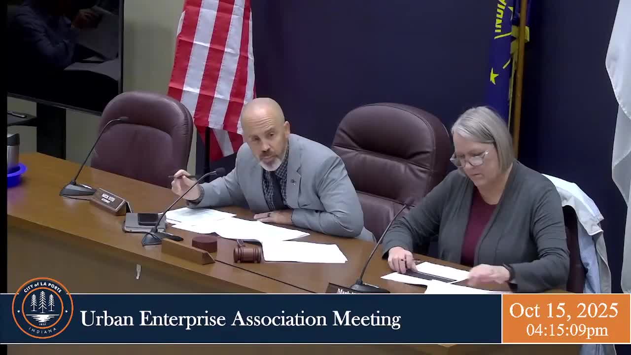
The Urban Enterprise Association reviewed logo concepts and directed staff to have designer Jessica (and Lindsey) refine concept 2 with color and black-and-white versions for board review at the next meeting.
The Urban Enterprise Association reviewed several logo concepts prepared by the city and provided feedback, but did not adopt a final logo.
Board members discussed two main concepts — a compact rectangular option and a circular option — and noted concerns about how designs appear in black-and-white as well as in color. Several members said they preferred concept 1 in color but raised reservations about its black-and-white rendition; others favored the circular concept for stationery use.
The chair asked Bill Gertner to coordinate with Jessica and Lindsey on revisions. The board asked staff to return to the next meeting with refined concept(s), including color and black-and-white versions, and to explore minor adjustments such as spacing between building elements and alternative tone options so the logo sizes properly across uses.
